


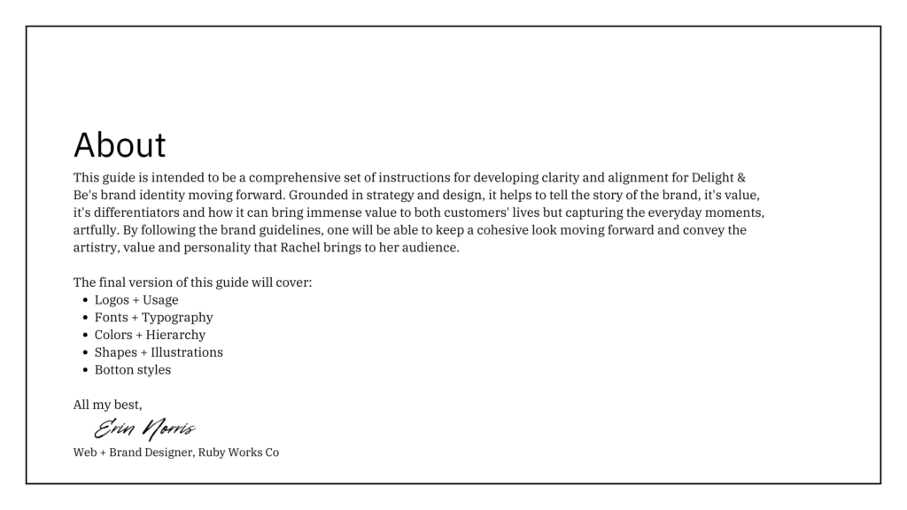
Ohhh, this case study is ALSO a fun one. Maybe I’ll say that every time.
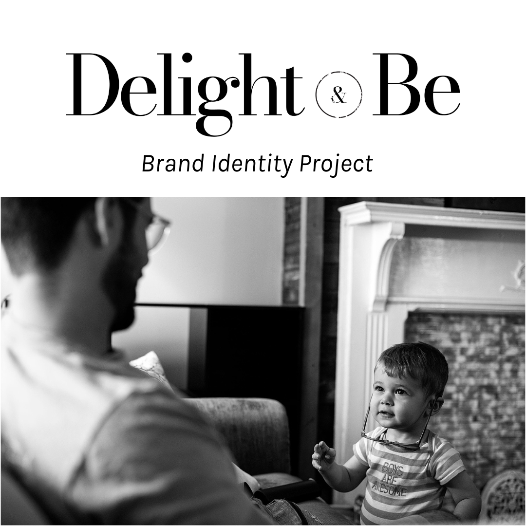
This case study is going to follow the process of creating a new brand identity for my client Rachel, who is yet another dream client. Before we get too far, all photos are courtesy of Delight & Be Photography.
While other people might have hesitations about being that direct on the intro call, please don’t if you work with me. Bring all the opinions to the front. I love them. It helped the project develop clarity; which is paramount for developing a completely new brand identity.
Rachel semi-recently relocated to the Bay Area, and manages many things, but we’re going to focus on her photography business.
As soon as we jumped on the discovery call, I knew that she was going to be so fun to work with. She was pretty relaxed about the process, eager to follow whatever system that I had in place, and she was transparent about the aspects of branding that she already has opinions and preferences.
She listed several different concepts and ideas that she had for the brand direction. In addition, and perhaps even more helpful, she was upfront about things that she doesn’t like aesthetically.
While other people might have hesitations about being that direct on the intro call, please don’t if you work with me. Bring all the opinions to the front. I love them. It helped the project develop clarity; which is paramount for developing a completely new brand identity.
Transparency also makes my heart and brain SO HAPPY. The project was so fun.
Even more helpful; her communication style gave me the permission to be really, really clear about how to effectively use the brand concepts without feeling like I had to walk on eggshells.
We both took direction from each other very well and I think that type of collaboration is what made the project SO successful.
Initial Challenges
Initial challenges were pretty clear and easy to navigate.
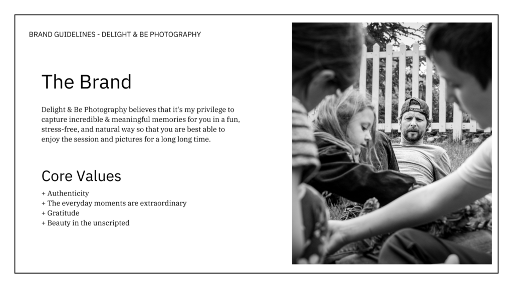
- Rachel’s a down to earth, Philadelphia Eagles fan, with a warm heart. Just like her Philly roots, the brand needed to have a sense of raw authenticity to it, while also looking elevated and sophisticated.
- About 80% of the website that she was envisioning to build for herself (using a Tonic Template) was going to be black & white. So the brand needed to cooperate with that.
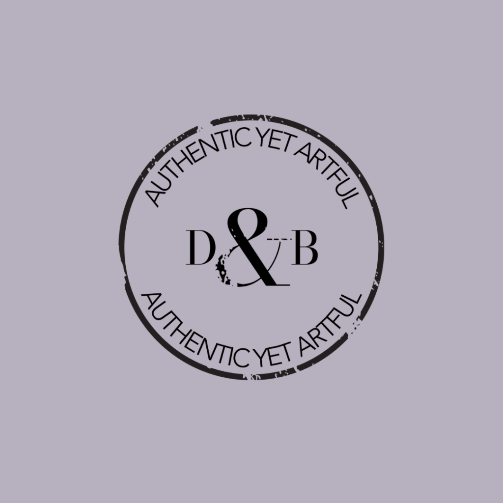
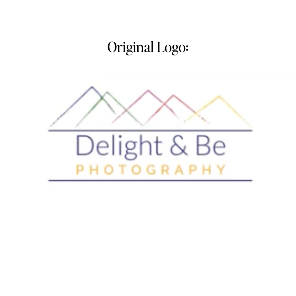
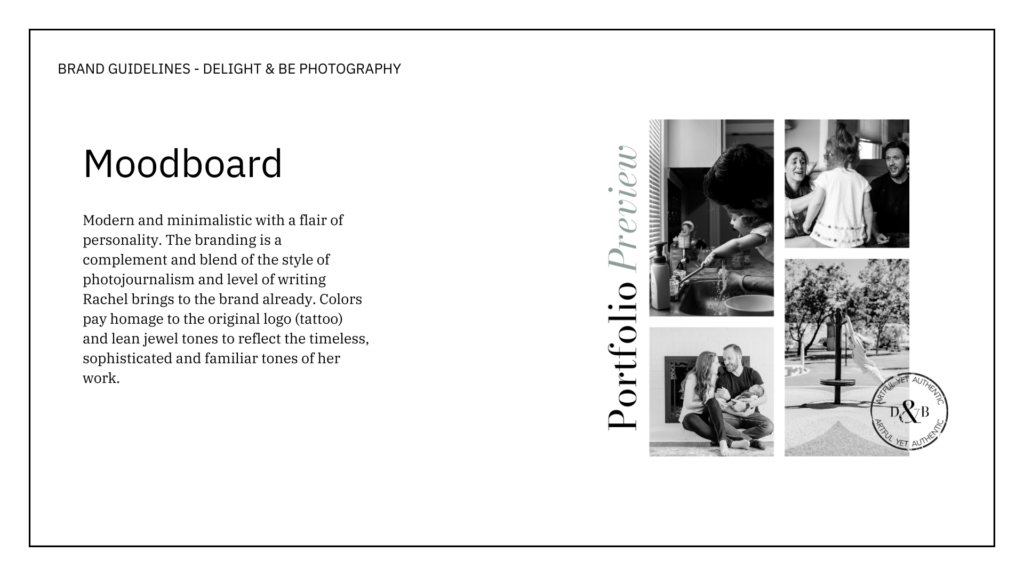
- The original logo (pictured below) is a personal concept that is near and dear to Rachel, but she knew that it did not align with the business’ direction. She was clear that we didn’t have to pull any imagery from the original logo, and addressed the parts of it that she liked. The original logo inspired the varied and playful colors in the color palette.
Implementation
After the initial kick off call and all of the context provided in my Brand Questionnaire, it was time to get working on the first draft of the new brand identity.
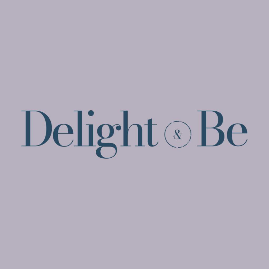
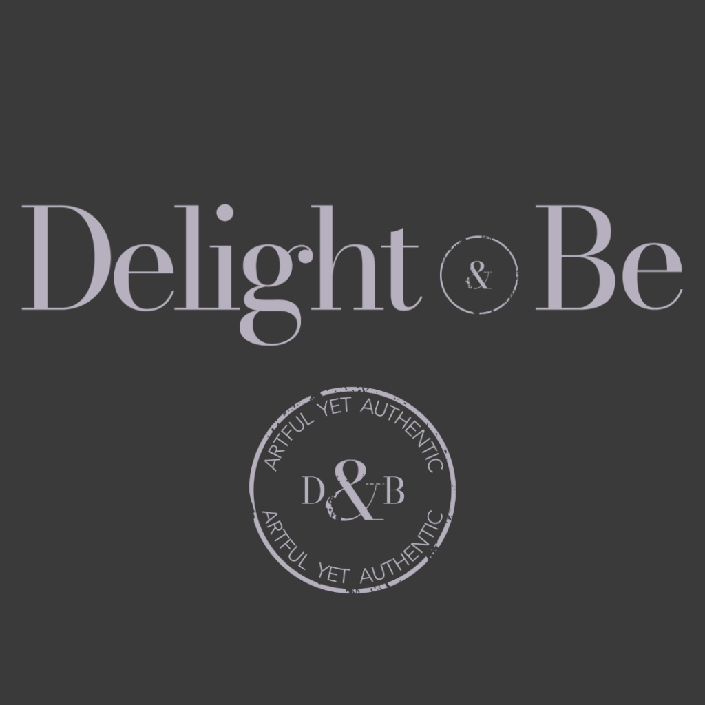
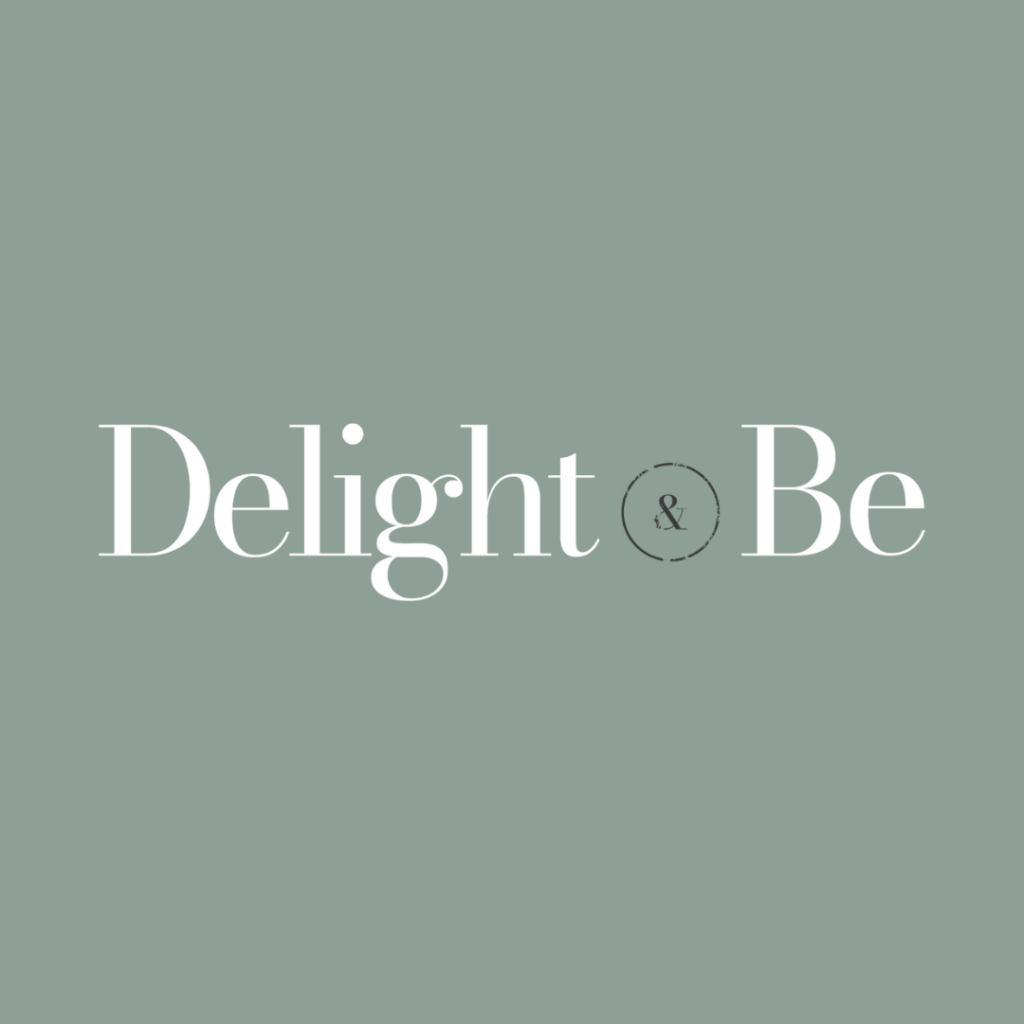
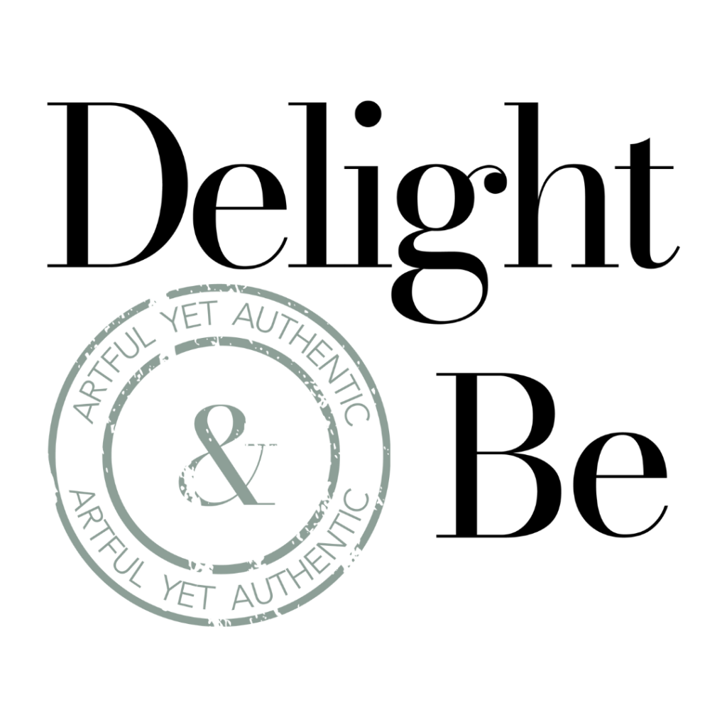
I began with the color palette, referencing color psychology, her core values, and the sample photos she provided. Then, I began working on the logos and font pairings next.
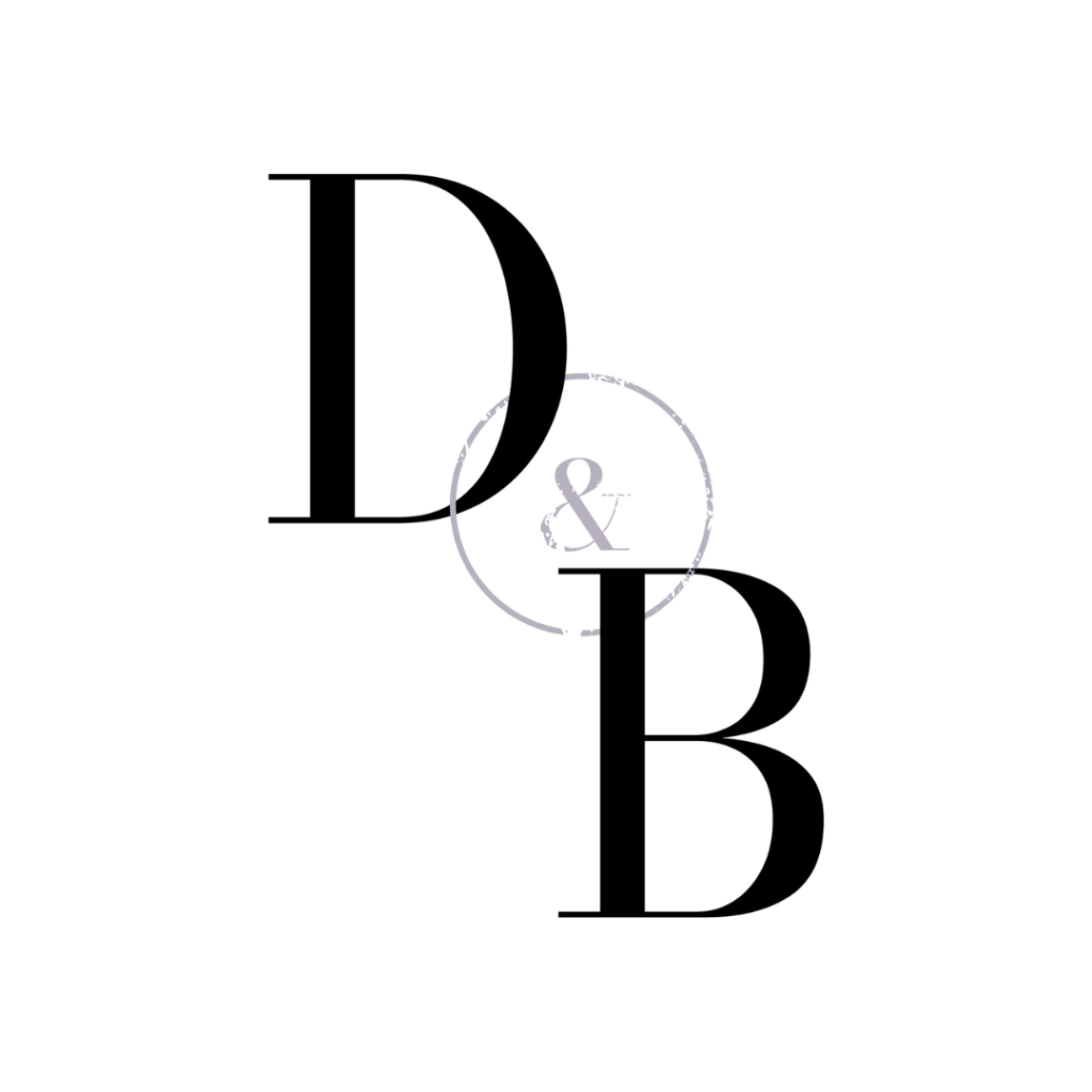
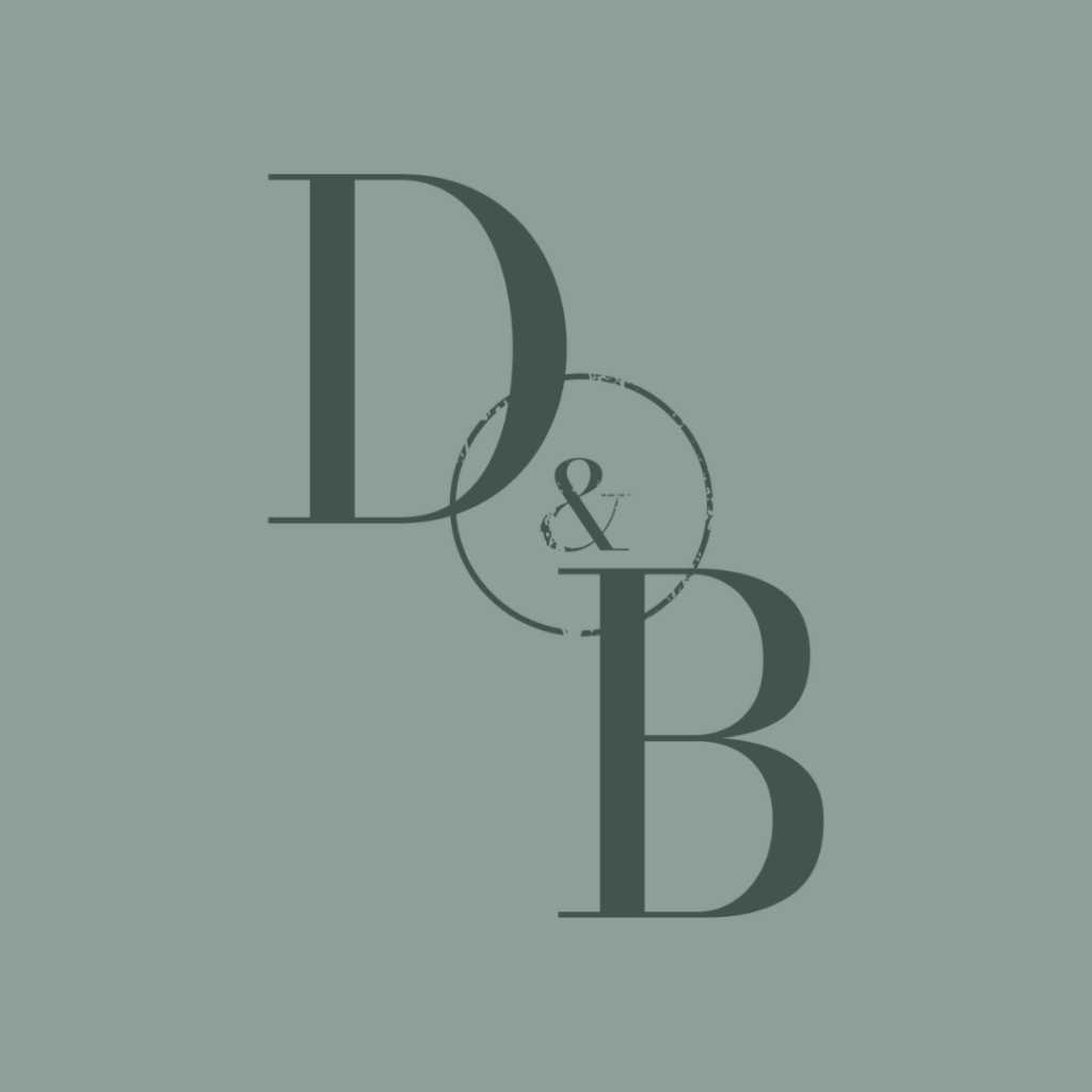
The logo suite was SO fun to present, and it took a few revisions to get the alignment to “fit” properly. Additionally, I presented 2 variations of the logo mark, and she asked for both of them. Sometimes a concept just works.
This project was a great reminder that some people are drawn to aesthetic symmetry (what feels like it is aligned to the eye) and others are drawn to precise symmetry (AKA literal symmetry).
Conversations about the logo alignment and font pairings were especially fun because Rachel was exceptionally clear about what felt right to her, and that’s what is most important. I mean, we’re talking about millimeters here.
Version 1 of the brand identity went over really well. We were about 80% finalized, with one color that didn’t resonate very well and some logo adjustments.
I got to work on the edits and rounding out the final 21-page PDF to include everything from button styles, shapes, line styles, backgrounds and a whole suite of mock ups for reference.
Together, we nailed it.
Project Highlights
Besides the level of communication and transparency, the highlight for me was the complete transformation of the brand – in a way that still felt like Rachel.
It also melds really well with her photography work. My favorite are the soft and bold colors that she gets to play with moving forward.
Perfection.
I will die on the following hill: classic design doesn’t have to be boring.
Measurable Results
Perhaps the biggest win for this project was the confidence that it sparked in Rachel to validate her prices moving forward. Like so many businesses, her work has evolved much faster than her brand and website.
This brand kit jumpstarted the next chapter of her business and I’m so happy to be part of it.
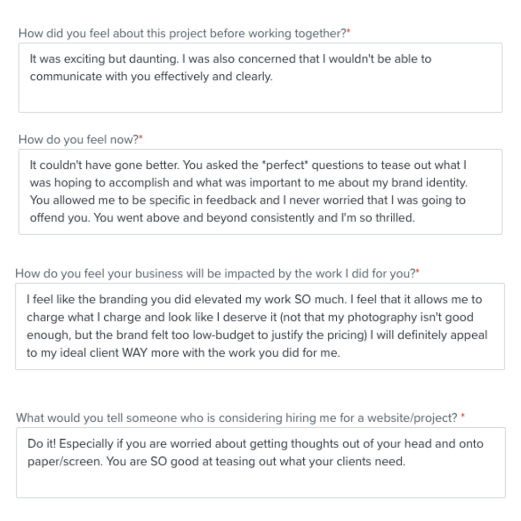
Below, left: responses from Rachel’s post project form regarding the process overall.
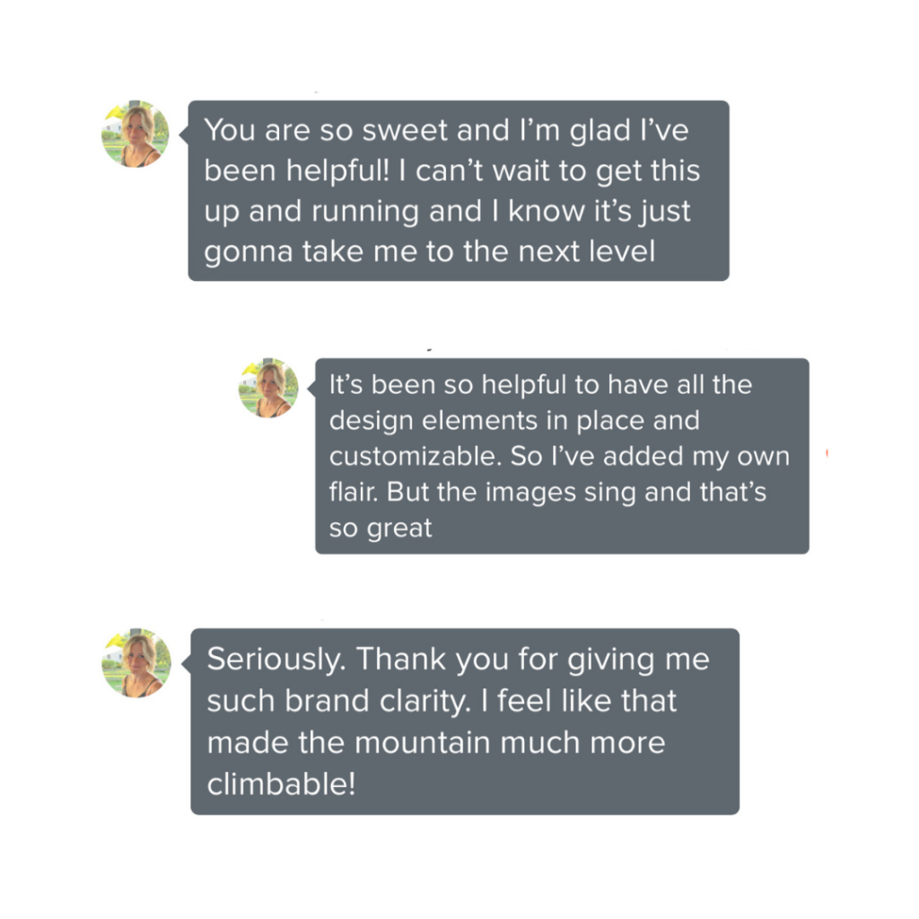
Below, right: comments from our Voxer chats throughout the process.
Client Testimonial
“Working with Erin from Ruby Works was absolutely one of the best things I’ve done for my business. Before working with her, my branding was a DIY mishmash of things I liked. I had so many ideas swirling in my head and she asked the perfect questions to draw out what was important to me and to my brand. She helped clarify so much. She was more than open and receptive to feedback, and never once did I worry I was offending her. Though, I didn’t change much – she really nailed it.
– Rachel
If you are thinking about branding or rebranding, I would highly recommend Erin. She’ll knock it out of the park, and she’ll cheer you on in the process!“
That feels like a mic drop moment for me.
Thank you for being here, you’re an absolute gem.
xo,
Erin


View comments
+ Leave a comment